#ThrowbackThursdays
History is vital and important. In this series, Nancy Sharon Collins, design history aficionado, will expound upon design history, one Thursday a month, in essays that throw you back in time to learn and understand design’s roots as an industry and design thinking and theory.
Last year, Intellectbooks published my article, Engraver, communicator of content, in ‘Book 2.0 : Volume 1 / Issue 2’ (available from their website). The original article was written for scholars of type and design history, so it is a little thick going. This article, written for AIGA New Orleans chapter, provides highlights of the article’s juicier content, in addition to quotes from the May 9, 2013 IQ Overview by Intellectbooks, and my book, ‘The Complete Engraver: A Guide to Monograms, Crests, Ciphers, Seals, and the Etiquette and History of Social Stationery’, published by Princeton Architectural Press in September, 2012.
This discussion will refer to four historically important works of engraving that illustrate why engraving has been influential to the development of type and design: I. ‘The Great Mirror of Folly’ (Het Groote Tafereel Der Dwaasheid, ca. 1720); II. Samuel Sympson’s ‘A New Book of Cyphers’ (1726); III. George Bickham’s ‘The Museum of Arts: or, The Curious Repository’ (1745?); and IV. ‘The Lincoln Crest & Monogram Album’ (ca. late 1800s). I believe that engravers have always had a greater freedom of expression than traditional typographers. Unlike traditional typesetters, who might be confined to type styles already on hand, and to generally structured pages within the confinements of a grid structure, engravers have always had the opportunity to be more lyrical and spontaneous.
Though it remains a rich and provocative subject for teaching and writing, engraving is not considered to be central to the history of type development. This is because, strictly speaking, what we think of as “type” is a technology and not a tangible object. Type technology—the method by which words have been printed for centuries—consists of little character (type) blocks arranged in a grid (called a chase) to form a word, sentence, paragraph, and or page. Once combined, the chase could be placed in a printing press machine, ink applied to the type’s surface, paper placed atop, then the whole entity would be run through a press, resulting in a printed representation.
Originally, there was one character per block, and over time all blocks became standardized to a 23.3 millimeters height (now known as “type-high”), and these blocks were used in hand-set letterpress printing (this handset letterpress method is also the foundation upon which our current typographic technology is based). Conversely, engraving was accomplished by cutting intricate lines into thin plates—plates much thinner than the blocks of letterpress. This produced an incompatibility between the two printing processes, namely that engraving plates were not type-high. As a result, an engraved image and letterpress type together on the same page required two different technologies and two different assemblies, and it was never cost effective to use them both to produce a single design. To quote from my book, ‘The Complete Engraver’:
While Gutenberg, credited by some as being the father of popular media, was busy typesetting and printing his 42-line Bible, he was also trying to develop a cost-efficient means for commercial engraving. Depending upon which version of the story you read, his backers either took advantage of him or he was not a great businessman, because his engraving venture went nowhere. However, investing in the technology of printing imagery and type simultaneously made good business sense. Engraved images at that time were from copperplates, which are thinner than the type-high standard for letterpress. Therefore, to print both text and imagery on the same sheet required two separate set-ups and press runs: one pass through the press for type and a separate pass for the image. The invention of a way to produce illustrations within the confines of a letterpress machine, with its flexibility in easily changing and reusing type, could have been a potential industry breakthrough. It might have altered print and design history forever, shifting our type-heavy historic gaze to a more inclusive print tradition of how words and images were created to fit together. It would take an additional three hundred years, with the advent of lithography, for this synthesis of word and image to occur, and it was later still, with the invention of photomechanical processes, that the book publishing industry fully benefited from the simultaneous printing of type and pictures.'The Complete Engraver'
Though perhaps an oversimplification of printing history, I offer this straightforward explanation of the two different technologies: in old-fashioned, pre-digital book production, letterpress formed the words and engraving made the pictures.
This is not to say that all type is boring, nor does it take the back seat to illustration. However over time, and certainly now with digital fonts, the big challenge of setting type is to ensure that it functions to produce readable text. By contrast, engravers (much as illustrators, hand letterers and people who draw) have always had a greater freedom of expression than traditional typographers. Engravers have always had the opportunity to be more lyrical and gestural than traditional type setters, who might be confined to immediately available type styles and the structure of pages within the confinements of a grid system. I liken this difference to a comparison between Adobe Photoshop and InDesign: whereas Photoshop is pretty free-wheeling, InDesign has a built-in structure that is decidedly grid-based. Therefore, I like to equate engraving to the freedom of Photoshop (i.e., picture-making), and InDesign to letterpress (setting type).
Historic Reference I.
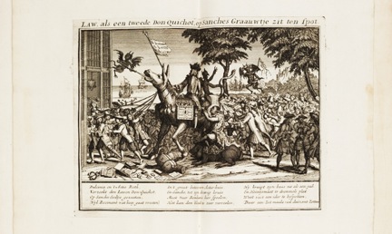
This image is just one of the many wildly satirical engraved plate in Het Groote Tafereel Der Dwaasheid, anonymously published shortly after the Dutch-English-French fiscal crisis of 1720 for which the term, “bubble” was first used when speaking about financial matters.
The figure shown above is an engraving from ‘The Great Mirror of Folly’ (Het Groote Tafereel Der Dwaasheid, uploaded onto Flickr by Carl Guderian, “blacque_jacques”.) It helps explain why I believe that engraving—print engraving, intaglio engraving—is important to think about while looking at type and graphic design. Here’s what Engraver, communicator of content has to say about Het Groote:
All of Het Groote is a curious object of cultural history, and the marvelously diverse engraved plates are so ribald they would make even Hogarth blush. The many engraved allegories (in some copies there are 75) are bawdy, with lots of exposed backsides from which emanate paper (symbolizing shares of stock), bubbles (referring to speculation), and the more usual products from that part of the human anatomy. One could imagine the engraver’s conclusions on the entire folly as, “I liken this embarrassing episode to a pile of …”'Engraver, communicator of content'
As can be seen, Het Groote juxtaposes many different calligraphic letter styles in one figure, an opportunity that was never to be had with hand-set letter press. The instance of multiple letter styles in close proximity provided following generations of type designers rich fodder for typographic inspiration, and thus shows how engraving has influenced typographic history.
Historic Reference II.
![Above are pages from ‘A new book of cyphers, more compleat & regular than any ever publish’d. Wherein the whole alphabet (twice over) consisting of 600 cyphers, is variously chang’d, interwoven & revers’d .. (1750)’. It is interesting to note that immediately following the title page, William Caslon signs his name of endorsement as an engraver to the ‘Book of Cyphers’ as “the moft [sic] Perfect & neateft [sic] Drawn, of any Performance of this kind hitherto Extant.”](http://neworleans.aiga.org/wp-content/uploads/2014/03/AIGANewOrleans-TBT-0327-historicreference2-300x177.png)
Above are pages from ‘A new book of cyphers, more compleat & regular than any ever publish’d. Wherein the whole alphabet (twice over) consisting of 600 cyphers, is variously chang’d, interwoven & revers’d .. (1750)’. It is interesting to note that immediately following the title page, William Caslon signs his name of endorsement as an engraver to the ‘Book of Cyphers’ as “the moft [sic] Perfect & neateft [sic] Drawn, of any Performance of this kind hitherto Extant.”
Above are pages from ‘A new book of cyphers, more compleat & regular than any ever publish’d. Wherein the whole alphabet (twice over) consisting of 600 cyphers, is variously chang’d, interwoven & revers’d .. (1750)’. It is interesting to note that immediately following the title page, William Caslon signs his name of endorsement as an engraver to the ‘Book of Cyphers’ as “the moft [sic] Perfect & neateft [sic] Drawn, of any Performance of this kind hitherto Extant.”
Reading further about important bibliographic specimens of engraved printed matter in Engraver, communicator of content, Samuel Sympson’s ‘A New Book of Cyphers’, ca. 1726 is a catalog of sorts containing ciphers (monograms) that could be used much like modern digital clip-art. While its typographic value may seem illusive, this work is of great interest as a cultural icon:
‘Cyphers’ is highly decorative and was a skilled craftsperson’s model for very high-end customization. This is a quality that, to this day, is very popular and a major selling point in many commercial endeavors, making’ Cyphers’ of all kinds enormously valuable in retail purchasing.
It was so successful (it’s a lot easier to appropriate a complex combination of decorative initials than to create one) that it went through multiple printings. Engraver, communicator of content continues by listing how many were located while researching Sympson’s ‘Cyphers’:
15 discrete specimens were found with six publication dates – 1704, 1726, 1729, 1739, 1750? and 1758. Four versions are microfilm or digital copies of originals in the British Library. A brief enquiry to the British Library yielded 30 physical copies published before 1800 and 37 from 1800 to 1900, all with variations of the title ‘A New Book of Cyphers’.
This book was successful for multiple reasons (economic, stylistic, cultural), and was praised in its time by famous type designer William Caslon because it depicted the epitome of engraved collisions (ciphers, commonly referred to as monogram and/or ligatures of two-or-more initials). It is an important piece of type history because, as evidenced by its goodly number of re-publishings and multiple derivatives under only slightly different titles, it illustrated the close relationship between typographic style and what is trendy, or what sells. As we discover the vast number of re-printings—over 20 from 1704 to ca.1750 and well over 60 post-1800—it is clear that engraved mash-ups of initials neatly catalogued, accessible alphabetically, and (according to the title) offered “twice-over”, remain useful reference points for practitioners in many fields.
Historic Reference III.
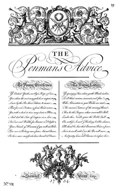
Above from The Universal Penman, 1743 engraved by George Bickham
George Bickham was a highly skilled and unique artisan, a calligraphic engraver. This enormously specialized vocation required physical and mental acuity in both calligraphy and engraving; it was through the product of the calligraphic engraver—the copy book—that most gentlefolk learned to write from the 15th-18th centuries. Probably the most famous of these remains: ‘The Universal Penman’,
…a specimen of that relatively rare piece of print and lettering history – the copy book – filled with examples of calligraphy, often engraved. It was produced and engraved by Bickham and members of his family, in 52 parts in 1733–41, and contains writing samples from some of the most famous writing masters of the day (Sloan 2000). The rather oddball art of the copy book combines the artistic mastery of calligraphy with the more esoteric skills of a master copperplate engraver, both of which Bickham the Elder excelled at. It is difficult now to imagine the years of dedication required to become an accomplished engraver, an effort that takes approximately ten years to master (Muir 1945).
However, Bickham is much less well known for ‘The Museum of Arts’, a fabulously curious volume of engraved imagery that I had the divine pleasure of examining at The Harry Ransom research library in 2009. Engraver talks about it thusly:
The most striking element of ‘The Museum of Arts’ is the apparent randomness of subject matter, a good deal of which is figurative. There is also a preponderance of artistically (not calligraphically) rendered animals and human forms, making the book quite unusual. While many copy books included smaller, calligraphically rendered animals and decorative devices, some ‘Museum’ engravings take over whole pages (Merken 1785)…
Evaluated from an educational point of view, the book is a supremely delightful example of what can be done with copperplate engraving, reminding us that engraving can be a wildly creative and emotive medium. This echoes back to the original generation of painter/engravers, (roughly from the dawn of print engraving in the 1540s to the mid 1600s) when engravers created pictorial content from their mind’s eye and not as the craft evolved into mere portraiture or copy work (Hind 1963: 118–39).
Rightfully, Bickham is popularly included in the pantheon of typographic influences. For my money, the least known of his works—‘The Museum of Arts’—is worth examination by contemporary type designers and typographic enthusiasts.
Historic Reference IV.
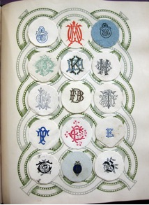
Above page of engraved ciphers and monograms from ‘Lincoln Crest & Monogram Album’, from my archive.
‘Lincoln Crest & Monogram Album’, published by William S. Lincoln in the late 19th century, is perhaps most deeply linked to socioeconomic changes relevant to typographic style. Again from Engraver, communicator of content:
For the Victorian-era middle classes, it was important to follow the aesthetics and social norms of one’s peers, but also to satisfy some sense of individual style. ‘The success of the middle-classes in the Victorian period can be seen in their ability to universalize a set of principles based on individuality and progress’ (Loftus 2011). Factories spewed out consumer goods at ever increasing rates, and mass media in the form of newspapers, magazines and periodicals were in ever increasing abundance. Advertising was a new medium, and it abounded with reasons why this or that product was a household necessity (Meggs and Purvis 2006). A perfect example of this is ‘Lincolns Fourth Edition’ that contains 52 pages of advertising alone! Display and advertising types were new, showy and more aggressive than those in previous generations. Thus it would have brought every manner of type and new letterforms into the parlor, the boudoir and anywhere there was light enough to read. While monograms, and monogram collecting, satisfied some newfangled Victorian urges, it also introduced new kinds of typography to an eager and willing audience.
Urges for collecting, decorating, and personalization continue to this day, and engraved lettering remains at-the-ready to typographically inspire. Engraver, communicator of content concludes:
Further, engraved monogram dies can still be found in specialty print shops in the United States (and probably elsewhere). These monograms are similar to designs in Lincoln’s albums. These very same styles have also migrated to the Internet, where they are advertised for sale by firms still engraving monograms for social stationery. To some extent, engraved monogram styles have entered so far into the mainstream that they are readily available for products as mundane as burping pads for baby.
Studying historic examples of engraving, in a typographic context, may not change definitions on the nature of type. Hopefully, though, spending time with these case studies has added a haptic layer of experience in the great legacy of the formal aspects of communication. In the words of Terrance Weinzierl, Type Designer & Advanced Data Finisher, Monotype Imaging, who just finished designing two new digital fonts based on old engravers’ lettering styles, “As a designer, the revival projects I’ve done – like Romany and now JMC Engraver and Feldman Engraver – have not only helped me understand typographic history better, but helped me learn how to build professional-grade fonts.”
At the dawn of the 20th century, Lincoln and a few other smart industrialists in England, India, France, Australia, and America, repurposed engraved examples of historic lettering styles by cleverly marketing engraved monograms, ciphers, crests, and seals to a ready and willing market in collecting albums such as ‘Lincoln Crest & Monogram Album’. These albums, experienced by being held in one’s own hands, introduced compelling (and possibly startling), engraved bits of typographic history to a whole new audience that previously would never have been exposed to this rich stylistic legacy on such an intimate scale. The average size of Lincoln’s monograms is under one inch high.
Lincoln’s catalogues coincided with the swift rise of many typographic innovations of the late 1800s, such as the invention of Linotype and the Monotype casting machine. Along with more traditional typographic inspirations, engraved calligraphy, monograms, ciphers, and glyphs of all kinds, were at the ready to inspire. History is there for us to feast on, and our examples of such magnificent typographic examples as ‘Het Groote’, Bickham’s ‘Museum, Sympson’s ‘Cyphers’, and Lincoln’s album prove that engraved letter forms continue to inspire!
— — —
Commissioned as companions to Nancy Sharon Collins’ book ‘The Complete Engraver’, JMC Engraver and Feldman Engraver are Open Type fonts developed by Monotype from original engravers’ lettering styles and are FREE for download from Monotype.
http://blog.fonts.com/2012/07/24/the-complete-engraver/