Announcing our new brand! It was a close call, but after a close run and a final tie-breaker vote last night, purple beat out gold in the brand options we presented! The typeface Haptik won by a good margin, many of you citing that you liked the serif/sans-serif combination.
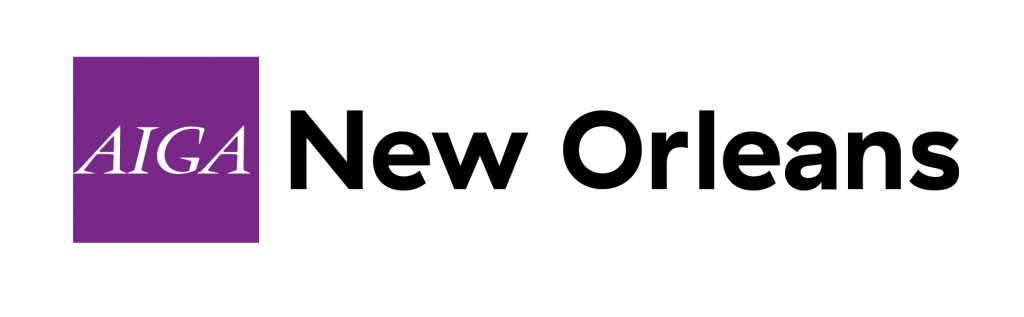
You all had your branding expertise at full power and we loved to hear your feedback! The majority of users who chose purple also chose Serifa, but the majority of other users split on the color chose Haptik, which united the vote on our new sans-serif logotype. Just a reminder, these options were part of a national rebranding identity roll out. Our board was consulted at certain milestones of the new branding review, but otherwise the typefaces and colors presented during this polling were the same choices all chapters were afforded. We are ecstatic you were so passionate about our new brand!
“The color orange feels like the perfect option to me. It is warm and creative like the city of New Orleans. It relates well with social communication and it’s also appetizing just like the food culture in our city.” – Vote: Gold and Serifa
“Modern color that represents the greenery in NOLA. Type is OK but the sans serif is my preference because it contrasts nicely with the AIGA brand.” – Vote: Lime and Haptik
“Color: Intense, happy, festive, vibrant, optimistic, shameless. Type: A little nod to tradition is in order here. The slab serif, while definitely sharp and modern, has just a hint of riverboat in it. The Silicon Bayou needs a blend of wood and plastic. The sans-serif option is all plastic.” – Vote: Gold and Serifa
“We are bold, fun, exciting city and state. I believe that the type and colors convey that.” – Vote: Purple and Haptik
“The one with more blue green option made me think of the river. For the logotype, I didn’t like the mixing of serifs, so I chose the sans.” – Vote: Teal and Haptik
“Thanks for the chance to provide my $.02 :)” – Vote: Purple and Serifa
That’s right, folks! Our national organization rolled out updated brand options this month!
 Our national organization contracted Kiss Me I’m Polish to help update AIGA’s brand while preserving its history and to also unify chapter branding across the country. As you travel and engage other chapters, they will be using the same branding options presented here. You may see the national organization use all 10 colors and our own chapter use these options in an abbreviated version or with our tagline.
We’re excited to give our marks and materials a refresh, but before we can, we asked your opinion!
After careful review over the options, the board narrowed down the color choices and options to present to the public for a poll! Put your branding knowledge and love of our chapter to use and cast your vote today!
Check back here after next Wednesday for our official reveal!